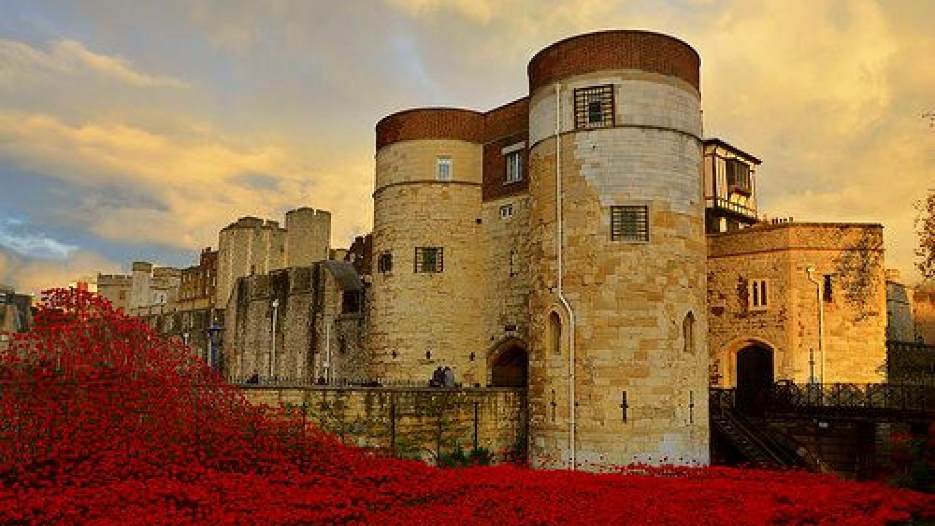
My ceramic poppy arrived in the post today – one of the 888,246 made for the “Blood Swept Lands and Seas of Red” at the Tower of London, a poignant commemoration of the centenary of the start of the First World War. It has moved thousands of visitors and was an inspiring fundraising initiative, with the proceeds of each sale benefiting selected service charities.
Yet I think the fundraising was let down by a lack of transparency about exactly how much of the proceeds made it to the causes selected, making it an unfortunate example of how public trust in charities can potentially be undermined.
A notice at the Tower and on the website was efficaciously telling the public: “10% from each poppy, plus all net proceeds, which we hope will amount to millions of pounds if all poppies are sold, will be shared equally amongst six service charities.” It provided no more detail or figures.
This struck me as quite an opaque statement in an age where the demand for transparency is higher than ever. Research from our Charity Awareness Monitor shows that some 51% of the public are put off donating by charities not being clear enough about how they spend donations. That figure is higher than for any other answer.
I tried to google exactly how the other 90% was actually spent, as given that I was paying for my own postage and packing, and knowing that all the manufacturing, planting and picking was done by volunteers, it was hard to guess. Dozens of social media postings appeared in the results voicing dismay that such a small percentage was guaranteed to make it to charity.
Many had missed entirely the hazy detail that the ten percent would be topped up by net proceeds, instead assuming only a small amount would make it and that someone else would be pocketing the rest. Attempts to reassure, posted either by the Tower or even other social media users, didn’t appear particularly effective.
This is a useful reminder that when charities are not transparent, the risk is that the public will draw their own conclusions – and often they won’t be positive.
Recently, we conducted some ‘transparency audits’ in our free report ‘Searching for Answers’, a study analysing how easy or difficult it was to find selected pieces of information on 50 selected charity websites. They revealed that there are many gaps in transparency across the sector and that, as a sector, we all ought to be doing more, but this need not be difficult.
We’ve made five simple suggestions any charity can implement to give the public the transparency they’re after:
- Present all the key information on the website, not just in the annual report
- Use infographics to present the charity’s impact in an aesthetically appealing manner
- Include both ‘positive’ and ‘negative’ facts and statistics, with explanations on the same webpage
- Develop a ‘Key Facts’ button or tab on the homepage, so the public can logically locate the information
- Use graphs to present statistics or finances in a way that is accessible and easy to understand
To find out more about measuring how transparent the public think your brand is, how much they trust you and the key issues or misperceptions that may potentially be holding back your brand, click here.
Did we become a Tower of strength? Or is this poppycock? Leave us a comment below.
Interesting matter you raise.
Interesting matter you raise.
Telegraph Money published an interesting chart on 22 November which I showed to my daughter who has worked for and alongside various charities including Save the Children and Oxfam. She was somewhat appalled by the figures published for British Red Cross and Salvation Army Trust-as a donor to both so was I.I think the table shows huge inconsistency in how figures are analysed. Whether the new SORP will correct this is open to debate.
It will be interesting to see the outcome of the Poppies at the Tower.
Whatever criticism is made there is little doubt that as an exercise in raising public awareness it was a huge success.

